Why That Cobalt Blue Looks Stunning on Your Wall But Weird on Your Body (And How to Fix It)
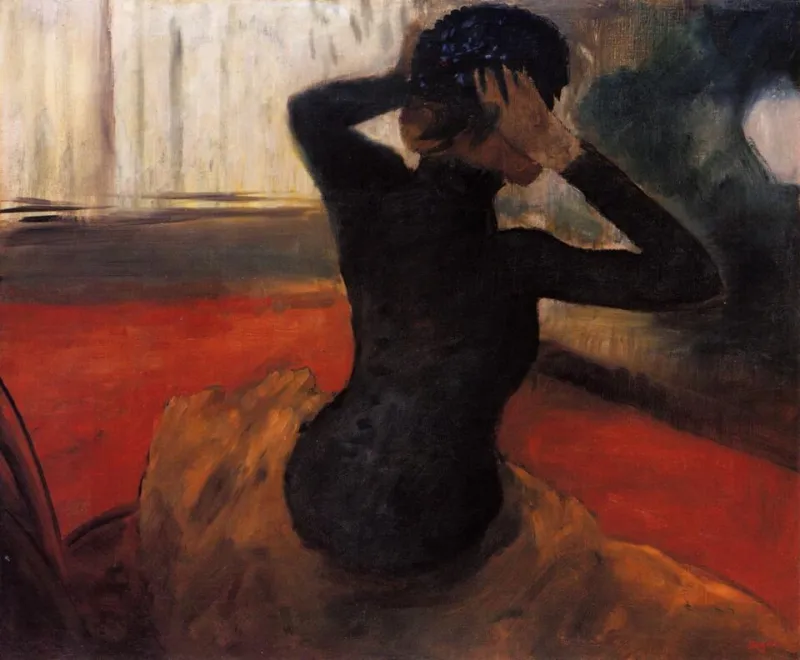
Photo: Edgar Degas, Public domain, via Wikimedia Commons
You know the feeling. You spend a Sunday afternoon obsessing over a Pinterest board, fall completely in love with a rich terracotta or a punchy electric violet, and then — inspired, emboldened — you go find that exact color in a dress or a blazer. You try it on. And something is just... off. The color that felt so alive on your screen, so perfect in your living room, suddenly looks flat or overwhelming or just plain wrong against your skin.
This isn't a failure of taste. It's physics. And once you understand what's actually happening, shopping for bold color becomes a whole lot less frustrating — and a whole lot more fun.
Light Is the Real Stylist in the Room
Here's the thing nobody tells you when you're scrolling Apartment Therapy at midnight: color doesn't exist in a vacuum. What we perceive as "color" is really just light bouncing off a surface and hitting our eyes at a specific wavelength. Change the light source, and you change the color entirely.
In your home, that cobalt accent wall is lit by a combination of natural daylight streaming through your windows, warm overhead fixtures, and whatever ambient glow your lamps throw off. That environment is relatively stable. The wall doesn't move. The light hits it from consistent angles throughout the day, and your eye adjusts gradually.
Your outfit, on the other hand, travels. You're wearing that cobalt blazer under fluorescent office lighting at 9 a.m., then in the harsh midday sun during your lunch walk, then under the warm Edison bulbs of your favorite wine bar by evening. Each of those environments pulls a completely different quality out of the exact same fabric. Cool fluorescents make blue tones pop and can make warmer colors look muddy. Natural daylight is the most accurate but also the most revealing — it shows every undertone. Warm incandescent light flatters reds and oranges but can make cool purples look almost gray.
So when that color you loved at home looks strange on your body out in the world, the lighting shift is usually the first culprit.
Undertones: The Hidden Language of Color
The second piece of the puzzle is undertones — and this is where things get really interesting.
Every color has a dominant hue (red, blue, green) and an undertone that leans either warm (yellow, orange, red) or cool (blue, green, purple). That terracotta you painted your kitchen? It might have a warm brick-red undertone that works beautifully against your cream-colored cabinets and wood floors. But if your skin has cool pink or neutral undertones, that same warm terracotta can clash with your complexion in a way it never clashes with your backsplash.
This is why two women can wear the "same" red dress and have completely different experiences. One glows. One looks washed out. It's not about the red being "right" or "wrong" — it's about whether the undertone of that specific red harmonizes with their skin's undertone.
The good news? Figuring out your undertones doesn't require a colorist or a cosmetology degree. Look at the veins on the inside of your wrist. Bluish-purple veins typically indicate cool undertones. Greenish veins lean warm. A mix of both? You're likely neutral, which means you have the most flexibility with color.
Saturation: Why Some Colors Feel "Too Much" on a Body
Home décor and fashion also play by different rules when it comes to saturation — how intense or pure a color appears.
A highly saturated, full-intensity color on a wall works because the wall is static, flat, and physically distant from your face. It becomes a backdrop. But when you wear that same level of saturation close to your face, it competes with your features rather than complementing them. The color becomes the main character, and you become the supporting role.
This doesn't mean you need to abandon saturated color in your wardrobe — not even close. It just means being intentional about placement. A deeply saturated cobalt coat worn open over a softer, more neutral layer lets the color make its statement without overwhelming your face. A maximally saturated skirt or wide-leg trouser keeps the intensity lower on your body, where it reads as bold and intentional rather than consuming.
Think of it the way an interior designer thinks about an accent wall: you wouldn't paint all four walls that high-intensity shade. You choose your moment.
How to Actually Translate Your Color Crushes into Wearable Pieces
So you've got a Pinterest board full of colors you genuinely love. Here's how to move from inspiration to your actual closet without the disconnect:
Test the color in motion. When you're shopping — whether in-store or online — try to see the item in multiple lighting conditions before committing. Take it to the store window. If you're shopping online, look for photos shot in natural daylight rather than studio lighting, which is often manipulated to make colors pop.
Swatch before you splurge. If a paint color has you obsessed, grab the paint chip and hold it up against your face in natural light. Does the undertone work with your skin? That's your first read on whether the wearable version might work too.
Shop for your undertone, not just the hue. You might love orange in the abstract but find that warm, yellow-based oranges make you glow while cool, red-based oranges fall flat. Spend some time figuring out which version of your favorite colors actually works with your complexion, and then shop within that lane.
Use your home palette as a mood reference, not a literal guide. If your living room is full of jewel tones — sapphire, amethyst, forest green — that tells you something important about the color energy you're drawn to. But rather than replicating those exact shades on your body, look for fashion pieces in that same tonal family and let your skin undertones guide you to the specific version that works.
Embrace the power of near-neutrals. Some of the most wearable bold colors are ones that have been slightly desaturated — dusty rose instead of hot pink, slate blue instead of royal, sage instead of kelly green. These shades are easier to wear across different lighting environments because they don't shift as dramatically. They're still bold, still colorful, still very much a statement. They just travel better.
The Real Goal: Color That Moves With You
At Pinkia Arora, we believe color is one of the most powerful tools a woman has — not just for style, but for how she moves through the world and how she feels doing it. That's not diminished by understanding the science. If anything, knowing why certain colors work for you makes you more fearless, not less.
When you stop chasing a color because it looked amazing on someone else's wall and start choosing colors that actually harmonize with your light, your undertones, your life — that's when getting dressed stops being a gamble and starts being a genuine act of self-expression.
Your home can inspire your wardrobe. It just doesn't have to be a carbon copy of it. Take the feeling. Take the energy. Then find the version of that color that makes you the accent wall.