Why the Color That Makes Your Living Room Pop Completely Flattens You in a Outfit
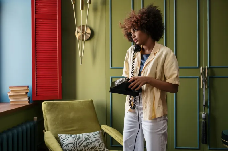
The Wall Lied to You (And That's Okay)
Here's a scenario that probably sounds familiar. You fall head over heels for a color — let's say a deep, saturated emerald green. You use it everywhere. Your throw pillows. Your kitchen towel set. Eventually, a feature wall. The whole room comes alive. You feel like an interior design genius.
Then you spot an emerald green blouse at your favorite boutique and think, obviously. You buy it. You wear it. And something is just... off. The color that felt electric in your living room now makes your complexion look dull, your under-eye circles more pronounced, and your whole vibe somehow less energized rather than more.
You didn't lose your taste. The color didn't change. But the context changed everything.
This disconnect is one of the most common frustrations women run into when they try to translate their home aesthetic into their wardrobe — and there are real, science-backed reasons it happens.
It's All About Proximity (Literally)
When a bold color lives on your wall, it's operating at a distance. Your eyes take it in as part of a larger composition — balanced against your furniture, your flooring, your lighting fixtures, the art you've hung. The color has room to breathe, and more importantly, it's not competing directly with your skin tone, your hair, or your eyes.
The moment that same color moves to your collar, your neckline, or your face-framing scarf, the rules completely change. Now it's in direct conversation with your complexion. Color theorists call this the principle of simultaneous contrast — the way two colors placed next to each other mutually influence how each appears. Your skin tone and the fabric color are essentially arguing with each other, and one of them is going to win.
If the color pulls in a direction that clashes with your undertones, your skin reads as sallow, ruddy, or washed out. The color itself might look perfectly fine — but you in the color is a different story entirely.
Lighting Is Doing More Work Than You Realize
Your home's lighting is curated. You probably have warm-toned bulbs in your living spaces because they're cozy and flattering. That terracotta wall looks incredible under warm Edison-style light because the whole palette is singing in the same key.
Your office? Likely fluorescent or cool daylight. The dressing room at that department store? A different story altogether. And natural outdoor light — the most honest light there is — strips away any illusions.
A color that glows under warm incandescent light can turn harsh and unflattering under cool or neutral lighting. This is why you should always, always step outside or find a window before committing to a bold color purchase. What you see under retail lighting is essentially a lie your wallet doesn't need.
When you're choosing colors for your walls, you're choosing for a controlled environment. When you're choosing colors to wear, you're dressing for every environment — your car, your office, the restaurant at lunch, the fluorescent nightmare of a grocery store at 6pm. The color has to hold up across all of it.
The Energy Expenditure Factor
Here's something that doesn't get talked about enough: wearing a bold color isn't passive. It requires something from you.
A vibrant color on your wall energizes the room. But a vibrant color on your body energizes you — or it's supposed to. The thing is, some colors demand a certain level of presence to carry them well. They need you to meet them halfway.
If you're someone who finds the color red exciting and powerful, wearing a red dress might feel like an extension of that energy. But if red makes you feel exposed or anxious — even subconsciously — wearing it isn't going to feel bold. It's going to feel like work.
This is why the same cobalt blue that makes you feel calm and sophisticated in your bedroom might feel overwhelming on your body on a Tuesday morning when you're already running late and emotionally stretched thin. Your home colors hold the energy. Your outfit colors ask you to generate it.
Knowing this changes how you shop. Instead of just asking "do I love this color," start asking "do I have the energy to wear this color" and "does this color give me energy or ask me to spend it?"
Translating Your Home Palette Into Wearable Color
None of this means you have to abandon your favorite hues at the door. It just means you need a smarter translation strategy.
Start with the undertone, not the hue. If your home is full of warm terracottas and burnt oranges, don't reach for those exact shades in clothing. Instead, identify the undertone — warm, earthy, amber-adjacent — and find fashion colors that share that quality. A warm-toned rust, a caramel yellow, or a muted brick red might carry the same energy as your beloved terracotta without creating that jarring proximity contrast.
Move the color away from your face. If you're obsessed with a color that doesn't flatter you at the neckline, try it as a wide-leg trouser, a maxi skirt, or a statement bag. You still get the color. You still feel connected to it. But it's not battling your complexion for attention.
Test under honest light. Before committing to any bold piece, take it to a window or step outside. That's the light most of your life happens in, and it's the only real test.
Consider saturation levels. The deeply saturated version of a color might be perfect on a wall where it has square footage to justify itself. On your body, a slightly less saturated version — think dusty rose instead of hot pink, sage instead of Kelly green — often reads as more sophisticated and is easier to wear across different settings and energy levels.
Your Home Is Your Color Lab
Here's the reframe that changes everything: stop thinking of your home's color palette as a wardrobe blueprint and start thinking of it as a research tool.
The colors you choose for your living space reveal what you're genuinely drawn to, what makes you feel good in an environment you control. That data is gold. It tells you your color personality — whether you gravitate toward bold and saturated, moody and deep, warm and earthy, or cool and graphic.
Use that information to shop smarter. If your entire home is cool-toned — lots of slate blue, soft gray, muted plum — chances are those cooler hues will also work beautifully in your wardrobe. If your space is a warm maximalist dream of mustard and rust and olive, your clothing palette should probably live in that same warm family.
The goal isn't to match your walls. It's to understand yourself well enough to make color work for you instead of against you — in every room you walk into, including the ones you didn't decorate yourself.