Why Your Favorite Bold Colors Look Off in January (Hint: It's Not Your Imagination)
The Moment You Noticed Something Was Off
You pulled out that gorgeous cobalt wrap dress — the one that got compliments every single time you wore it last summer — and something just didn't land the same way. The color felt harsh. Your complexion looked washed out. You ended up reaching for the gray sweater anyway and told yourself you just weren't "feeling it" that day.
Here's the thing: it wasn't you. It was physics.
The way color registers — on walls, on fabric, and yes, on your actual body — changes depending on the light source, the surrounding environment, and the natural backdrop against which you're being seen. And nothing shifts that backdrop more dramatically than the seasons. If you've ever wondered why your summer color game feels flat come wintertime, you're not imagining things. There's real science behind it, and once you get it, you'll never look at your closet the same way again.
Light Is Everything (And Winter Light Is a Different Beast)
Summer light in the US is intense, warm, and direct. Whether you're in Charleston or Los Angeles, July sunlight has a high color temperature — it's bright, slightly golden, and it saturates everything it touches. Bold colors under summer light practically vibrate. That tangerine midi skirt looks like it was made for the world when the afternoon sun hits it on a rooftop in Austin.
Winter light is the opposite. It's cooler, flatter, and comes at a lower angle. In much of the country, from Chicago to Boston to Denver, you're dealing with overcast skies, shorter days, and a whole lot of indoor fluorescent or LED lighting. Cool-toned artificial light strips warmth out of colors. Yellows go greenish. Oranges lose their punch. Warm reds can look almost muddy.
This isn't a flaw in the color — it's just how light physics works. The same hue reads differently depending on the light source illuminating it. Fashion people have known this intuitively for decades. Now the rest of us can use it intentionally.
Your Skin Is Part of the Equation
Here's where it gets really interesting. Your skin tone doesn't just stay the same year-round — it shifts. If you spend any time outdoors in the summer, you're picking up warmth, a little bronze, maybe more melanin activation. That natural warmth in your complexion acts as a built-in buffer, harmonizing with warm, saturated hues like coral, golden yellow, or bright tomato red.
Come winter, that warmth fades. Cooler, paler, or more sallow undertones can emerge — especially for women with lighter skin, though this affects deeper skin tones too in subtler ways. The contrast between your complexion and the colors you wear shifts. A bold, warm-toned color that looked harmonious in summer can suddenly create a clash or a draining effect against your winter skin.
This is why color analysts often talk about "seasonal undertones" — and why a color that's universally flattering in concept might need to be recalibrated in execution depending on the time of year.
The Backdrop Problem Nobody Talks About
Think about the visual context in which you're usually seen during summer: green grass, blue skies, warm wood tones, sandy textures, bright natural surroundings. These backdrops are inherently harmonious with bold, warm, saturated color. Your hot pink sundress pops against a leafy park background in a way that feels intentional and electric.
Now think about winter. Gray sidewalks. Brown slush. Beige office interiors. Dark coats everywhere. Bare trees. The visual environment is muted, cool, and low-contrast. A bold color against that backdrop can either read as a stunning, intentional statement — or it can look jarring and disconnected, like it belongs in a different scene entirely.
The fix isn't to abandon your bold palette. It's to think about which bolds work with a cooler, more subdued backdrop versus a warm, saturated one.
Rethinking Your Palette by Season (Without Losing Your Identity)
None of this means you have to retreat into neutrals the moment Labor Day passes. Absolutely not. What it means is that you can be strategic about which bold colors you lean into, and how you style them, to keep your aesthetic alive and thriving year-round.
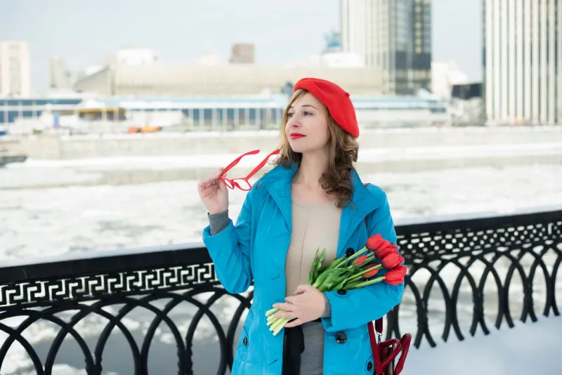
In winter, cool-toned bolds are your best friends. Electric blue, deep jewel-toned emerald, rich plum, icy lavender, true crimson — these colors are built for cool light. They don't need warm sunshine to activate. They hold their own against gray skies and indoor lighting in a way that warm-toned hues sometimes struggle to do.
Contrast becomes your styling tool. In summer, you might wear bold color head-to-toe and let the light do the work. In winter, consider using contrast more deliberately — a bold jewel-toned blouse against a dark base, or a rich emerald coat over a neutral foundation. The surrounding muted environment means you can let one piece do the heavy lifting.
Texture picks up the slack that light can't provide. Velvet, satin, and metallic fabrics catch and reflect artificial light in a way that matte cotton simply doesn't. A cobalt velvet blazer in January will read far more vibrant than the same cobalt in a flat cotton weave, because the texture is creating its own luminosity.
Layer your warm bolds with intention. If you're committed to your warm-toned signature colors — your corals, your mustards, your burnt oranges — you can still make them work in winter. The key is grounding them in a way that acknowledges the cooler environment. Pair that mustard turtleneck with deep chocolate or forest green rather than white or cream. It creates warmth within the outfit itself rather than relying on exterior light to generate it.
Reframe the Season, Not the Color
The most important mindset shift here is this: seasonal color adaptation isn't about shrinking your palette or compromising your style identity. It's about understanding your environment and dressing with it rather than against it.
Think of it the way a photographer thinks about lighting. The same subject, the same camera, the same lens — but the light changes everything about how the final image looks. You're not a different person in January than you are in July. But the light is different, the backdrop is different, and the way color reads in that context is different. The women who always look effortlessly pulled-together aren't necessarily wearing better clothes — they're just unconsciously (or very consciously) working with those variables.
At Pinkia Arora, we believe bold color isn't a seasonal trend you rotate in and out. It's a year-round philosophy. The palette just evolves — from the warm, saturated brights of summer to the deep, cool, jewel-toned richness of winter. Both are bold. Both are fearless. Both are completely, unapologetically you.
Your closet doesn't need a seasonal overhaul. It just needs a little light theory.